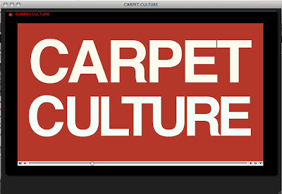
 I found Carpet Culture on VII's multimedia page, while I was researching about Antonin Kratochvil for Photo In Society class. Probably the only reason why I picked this one to watch without knowing what is in there was typography usage on this bright red background color, which was unusual among all the other pictures as display images.
 VII's multimedia page has thumbnails of different projects, where we can click on one, and it opens as a pop-up window. I am not sure how efficient this is and how visually appealing it looks. It is good that you don't really leave the actual multimedia pages, but this pop-up windows don't have the best look in the world. All I can do with this project is to start or stop it and moving back and forth in the control bar. There is no chapters or separate controls over the images. It is actually more like a video project than a multimedia project. We don't see any still photography until the very end of the piece. It is probably embedded as a movie file.
When I first started the project, I thought that the audio level was way too loud. I was shocked and panicked and tried to find a way to drop the audio for the first few seconds. Later in this video, there is a sharp cut to a few seconds of black space where we don't hear anything, too. As far as I know, two seconds of black space, which is ideally a full breathing time, is good in video editing to give a little break to the audience. But a balance should be caught that audience wouldn't question whether the movie ended or not. In this case, after all that chaotic interviews and B-rolls, the break is so sharp that I thought, it just ended like that or there was something wrong with the pop-up window. A little after this break there is a quick fade out and then fade in. If I were the editor of this project, I would definitely use a cross-fade instead of fading in and out. It would help the space and time transition occur smoother than this. Over-all this is not a very exciting multimedia project to watch but its content is interesting enough to keep the audience attention alive.


0 comments:
Post a Comment